Fall 2018


6 Principles of Design
This project is based on the principles of design minus color. There were many preliminary steps before I got to the final. The first few steps were translating images into the designs and then slowly adjusting them into representations of the principles.
There was also a back and forth between the drawing process and using cut black paper to differentiate from the basic line.
The final project, (shown to the left) contains all 6 principles made from meticulously cut paper. There is a combination of techniques such as paper weaving, pointillism, and overlapping shape. I feel the detailed work added more to the overall aesthetics to the piece. After spending over 12 hours working on the final product, I found it turned out very well and I had overwhelming pride for it.
Layered Perspective
This piece incorporates 4 layers of receding perspectives along with varying drawing techniques. To start this drawing process I first began with drawing repeating patterns in 1st, 2nd, and 3rd perspective. These patterns include the background repeating curvilinear lines, mid-ground repeating 'torn' circles, and the tube like figures that play between all layers including the foreground.
The usage of stippling helps to create the illusion of these tears in the flat plane moving back into space. There is also the illusion of depth with the 2nd line of each circle drawn based on how the viewer would see it.
This project forced me to think about space in ways that I do not normally do so. I found this to be extremely complicated, but I felt the final product exemplified the expectations of having many interweaving layers while also having a foreground, mid-ground, and background.
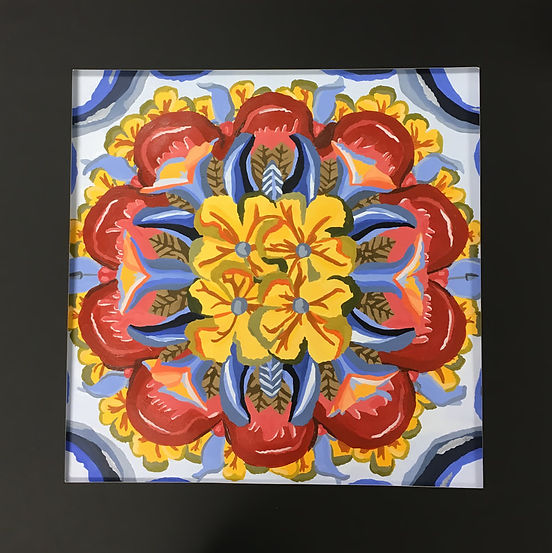
Fruit Translations
I was so happy we got the opportunity in this piece to work with color! As a foundation course there were students that had not yet worked with color so we did lots of color practice. Color and acrylic paint are my strong suits so I was excited to experiment with this 'color by number' style of painting.
After heavy manipulation to my original subject matter, which was a pumpkin and the varying parts or the growing process, my end product turned out very abstract besides the distinct flowers and petals. I used pumpkin stems, flower buds, flowers, vines, halves, and leaves as the basis for the many translations and distortions to the designs.
I worked originally with varying sized images of pumpkins and then traced the contour lines of the subject and continued to translate the contours with tracing paper until the mandala form looked how I wanted.